Wednesday, September 8, 2010

User Experience (UX) Tips (Buttons Vs. Links)

It is very important to know when to use links and buttons in your website. Both share some common properties like the clickable feeling, refreshing the page, navigating to another pages, performing specific tasks according to the user’s actions, so what’s the difference between them? Although all of these similarities of their behaviors we can say that links always used for navigation between pages, while buttons are used to perform a user action like adding, updating or deleting data, now end users become familiar with this concept, when they see a link in your page they are sure it is a navigation link to another page before they hit it, so try to keep this in mind in order to put things in their right places.

Tips for having better links:

  1. Always make the links style is different than any text in your website. By default links become with the blue underlined font style like this and the cursor is turned into a hand instead of the normal text cursor.
  2. Try to make users realize the links in your page without an extra effort by placing them in good places and styling them with differently.
  3. It’d be better to hide your link under a self describing label, for example: don’t use the famous Click here label for navigating to another page but use labels that describe its content  something like : Google
  4. Provide tooltips for your links in order to give the user some information about the contents of that link.

Tips for having better buttons:

  1. Be sure that your button have a self describing label for the action that’s going to take place after clicking it.
  2. Provide tooltips, precautions or hints so that the user knows what’s next after clicking that button.
  3. Don’t make your buttons look like links in their style, don’t lose the mouse hover, mouse up or mouse down effects on the buttons.
  4. Don’t use buttons for navigation or as menu items, use links instead.

Sunday, September 5, 2010

User Experience (UX) Tips (Confirmation Messages)

Confirmation messages is one of the basics to have a better UX for your application, while you are designing your confirmation messages many things should be taken into consideration so let’s list them.

conf_messages

  1. Message position: place your message in a place that is visible to any user and I do recommend to put it at the top of your page, so you will find it after the page refreshes.
  2. Message color: this is very important to distinguish between the success and error messages, so set the color of the message to be Green for success and Red for error.
  3. Message icon: having an icon that describe the content of the message is so important, for example you can set the icon for the error messages to be X (cross).
  4. Message content: be sure that your message’s content describes correctly the action has been done whether it’s an error message or a success message.
  5. Be sure to display messages after any action from the user, this will make him feel more comfortable with your application and will make him believe that the application is responding correctly to his actions.

Saturday, September 4, 2010

User Experience (UX) Tips (Cascading drop down lists)

Everyone of us faced the situation of creating cascading dropdownlists that are dependent on each other for example we have 3 drop down lists, one for Continents, the second for the countries and the last one for the states, so we need to select a continent first, then a country and finally a state, so I’m going to share with you the best ways to produce good UX for drop down lists (from my point of view)

Initial state, all disabled except the first one Continent was selected
  1. Don’t leave the first item of any drop down list as an empty item, if your dropdownlist has values of Countries, then set the first item to be “-- Select a country –”
  2. Be sure that all related drop down lists have the same width and height.
  3. At first make all drop down lists disabled except the first one until an item from the first list is selected, for example in the above scenario, the Continents dropdownlist should be enabled and the others are disabled until the user selects a continent, then after that selection the countries drop down list should be enabled and the states is disabled until the user selects a country.

Saturday, August 28, 2010

User Experience (UX) Tips (forms consistency)

When deciding to create your application’s forms, be sure to make all or most of related forms have the same page structure and design, why? because this will keep your forms consistent so that users can deal with all of them in the same way, let me show you some real life case to explain the importance of this consistency.

UX Consistency

Driving on different ways example

Say you are a good driver and you know well the way to your work, so you have learned how to avoid roads that have heavy traffic, or roads that might have some maintenance, so you are not focusing on the roads or how to drive, but what if you are going to work in a different way each day, then you will focus on the roads, traffic, radars locations. etc… So you will take a longer time that expected because each day you are experiencing a new way to go to work.

Let’s go back to software and match that case exactly with some web forms in your project

Say you have 2 forms one for adding/ updating countries and the other one for adding/updating measurement units and both forms have only one field for the name of the country and unit respectively. Let’s say that the structure or the design of these two forms is different, (say user will spend 15 min to learn how to deal with that form), so the user is going to spend 15 min learning how to deal with the 1st form and will spend the same time on how to deal with the 2nd form because they are different in design and structure and this will let him feel that your application is too hard to deal with and he may reject your project.
But what about if these two forms have the same design, if the user is going to spend 15 min to learn on of them, he will able to deal with all forms of that type in no time at all. Of course there are special cases you might face but try as much as you can to keep related things look the same.

Friday, August 27, 2010

Make any UI element drag-able in WPF using behaviors

in order to make your UI element drag-able without any extra code, all what you have to do is just selecting behaviors from Assets panel in Expression Blend then drag and drop the MouseDragElementBehavior to your UI element.
for example we will do this to a rectangle here you are the XAML code:

<Rectangle Fill="Red" Stroke="Black" Margin="230,218,172,132"><i:Interaction.Behaviors>
<il:MouseDragElementBehavior/> </i:Interaction.Behaviors>
</Rectangle>

don't forget to include these namespaces:

xmlns:i="clr-namespace:System.Windows.Interactivity;assembly=System.Windows.Interactivity" 
xmlns:il="clr-namespace:Microsoft.Expression.Interactivity.Layout;assembly=Microsoft.Expression.Interactions"

if you are working with Expression Blend, they will be placed automatically after setting the drag behavior, and if you are using Visual Studio you will need to set them manually

Wednesday, August 25, 2010

How to create a custom Jumplist with custom events in Windows Forms

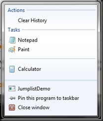
Jumplist_App Jumplist

Windows 7 introduced a new set of features one of them (and one of the most prominent feature) is the Jumplist, so we are going to explore the Jumplist features and I will show you how to handle custom events that are fired from custom tasks in the Jumplist.

Click here to view my full article in codeproject and to get the source code of the demo project. I’m waiting for your feedback

Tuesday, August 10, 2010

How to set an alternate row color in SSRS 2005

 I’m going to show you how to set alternate row color in a report that contains data displayed in a table using SSRS 2005
alternate_row_color
First you will have to select the details row in the design mode, then from the Properties panel select the BackgroundColor property and go to edit its Expression, you will find the default value is Transparent, so replace it with this line of code:
=IIF(RowNumber(Nothing) mod 2, "Wheat""White") and click OK
This line of code is telling the SSRS that if the row number was an odd number then make the row background color is White, else make it Wheat.
Run the solution and Have fun with colors.